Crypto charts look intimidating at first—a maze of colored bars, lines, and numbers that seem designed to confuse newcomers. But every successful trader started exactly where you are now, staring at a screen and wondering what any of it means.
The visual language of charts is actually straightforward once you know what each element represents. This guide walks through candlestick anatomy, support and resistance levels, trend identification, and the basic indicators that help traders make sense of price movement.
Your capital is at risk. Cryptocurrency trading involves significant volatility, and this guide is for educational purposes only—not financial advice.
What is a crypto chart and why it matters for trading
A crypto chart is a visual display of price movement over time, with price on the vertical axis and time on the horizontal axis. Reading one involves analyzing price action, volume, and trends, typically through candlestick charts that show four prices per time period: the open, high, low, and close.
Charts matter because they reveal patterns in how buyers and sellers behave. When you look at a chart, you’re seeing the collective decisions of thousands of traders compressed into a visual format. That history can offer clues about where price might head next, though nothing is ever guaranteed.
Price axis (Y-axis): Displays the asset’s value, usually in USD
Time axis (X-axis): Shows the period being analyzed, from minutes to weeks
Price action: The actual movement of price that forms readable patterns
Types of crypto charts you need to know
Three chart types appear across most trading platforms. Each displays the same underlying data but presents it differently, and candlestick charts have become the default for most crypto traders.
Line charts
A line chart connects closing prices with a single continuous line. It’s the simplest format and works well for seeing the general direction of a trend at a glance. However, line charts hide a lot of detail. You won’t see how much price moved within each period or where it opened, so most active traders prefer other options.
Candlestick charts
Candlestick charts pack the most information into each time period. Every candle shows four data points: where price opened, the highest point it reached, the lowest point, and where it closed. This format originated in 18th-century Japanese rice trading and remains the standard today because it reveals both direction and momentum in a single shape.
Bar charts
Bar charts display the same open-high-low-close data as candlesticks but use vertical lines with small horizontal ticks instead of colored bodies. Some traders who came from stock or forex markets still prefer this format, though it’s less common in crypto circles.
| Chart Type | Best For | Detail Level |
|---|---|---|
| Line | Quick trend overview | Low |
| Candlestick | Active trading and analysis | High |
| Bar | Traditional traders transitioning to crypto | Medium |
How to read a candlestick chart
Each candlestick tells a small story about what happened during a specific time period. Once you learn to read the parts, the whole chart starts to make sense.
What the body shows
The thick rectangular section of a candle is called the body. It represents the distance between the opening price and the closing price for that period. A green or white body means price closed higher than it opened, which traders call bullish. A red or black body means price closed lower than it opened, which is bearish.
The size of the body matters too. A long body shows strong movement in one direction, while a short body suggests less conviction from buyers or sellers.
What wicks and shadows reveal
The thin lines extending above and below the body are called wicks or shadows. The upper wick marks the highest price reached during that period, and the lower wick marks the lowest. Long wicks often signal rejection. If price spiked up but then closed much lower, that long upper wick shows sellers pushed back hard.
Bullish vs bearish candles
A bullish candle has a close above its open, indicating buyers controlled the period. A bearish candle has a close below its open, showing sellers dominated. Recognizing this distinction quickly becomes automatic with practice.
Bullish (green/white): Close is above open, buying pressure won
Bearish (red/black): Close is below open, selling pressure won
How timeframes affect candlestick meaning
Each candle represents one unit of whatever timeframe you select. On a 1-minute chart, each candle shows 60 seconds of trading. On a daily chart, each candle represents 24 hours.
Shorter timeframes capture more noise and rapid fluctuations. Longer timeframes filter out that noise and reveal stronger trends. Many beginners find daily charts easier to interpret before moving to 4-hour or 1-hour views.
Common candlestick patterns in crypto trading
Certain formations of one or more candles appear repeatedly and can hint at what might happen next. Patterns indicate probability, not certainty, and they work best when combined with other analysis.
Doji
A Doji forms when the open and close are nearly identical, creating a candle that looks like a cross or plus sign. The body is extremely thin or nonexistent. This shape signals indecision in the market, where neither buyers nor sellers gained ground. A Doji appearing after a strong trend can suggest that momentum is fading.
Hammer and inverted hammer
A hammer has a small body near the top of the candle with a long lower wick. It appears at the bottom of downtrends and suggests buyers stepped in to push price back up after sellers drove it down. An inverted hammer has the long wick on top instead and also appears after downtrends as a potential reversal signal.
Engulfing patterns
A bullish engulfing pattern occurs when a green candle’s body completely covers the previous red candle’s body. It suggests buyers overwhelmed sellers. A bearish engulfing is the opposite, where a red candle engulfs the prior green one. Both patterns are considered strong reversal signals when they appear at key price levels.
Morning star and evening star
The morning star is a three-candle pattern that appears at the bottom of downtrends. First comes a large bearish candle, then a small-bodied candle showing indecision, then a large bullish candle. The evening star is its mirror image at the top of uptrends. Both patterns suggest the prior trend may be ending.
How to identify support and resistance on crypto charts
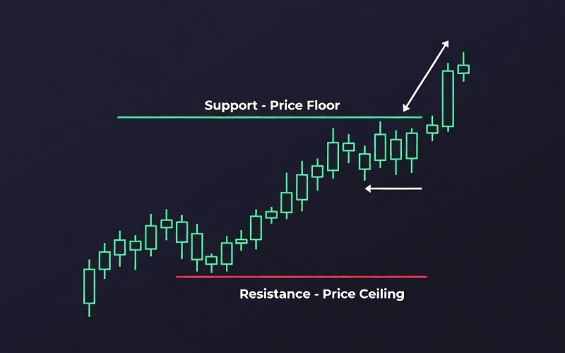
Support and resistance are price levels where buying or selling pressure has historically been strong enough to pause or reverse movement. Identifying them helps traders anticipate where price might react.
What is support
Support is a price level where demand has repeatedly been strong enough to stop price from falling further. Think of it as a floor. When price approaches support, buyers tend to step in, creating upward pressure. The more times price has bounced off a level, the stronger that support is considered.
What is resistance
Resistance is the opposite. It’s a price level where selling pressure has historically stopped price from rising further. It acts like a ceiling. When price approaches resistance, sellers tend to appear, creating downward pressure.
Why these levels form
Support and resistance form because traders have memory. If Bitcoin bounced off $60,000 three times last month, traders remember that level. They place buy orders there, expecting another bounce. Large institutional orders also cluster at round numbers and previous turning points, which reinforces the effect.
What happens when levels break
When support breaks, it often becomes resistance. Traders who bought at that level and are now underwater may sell when price returns to it, hoping to exit at breakeven. The same logic applies in reverse: broken resistance often becomes support.
Support holds: Price bounces, potential buying opportunity
Support breaks: Previous support may become new resistance
Resistance holds: Price rejects, selling pressure appears
Resistance breaks: Previous resistance may become new support
How to spot uptrends, downtrends, and sideways markets
Knowing the overall trend direction provides context for everything else. A bullish pattern in a downtrend carries different weight than the same pattern in an uptrend.
Identifying an uptrend
An uptrend consists of higher highs and higher lows. Each peak is higher than the last, and each pullback bottoms out above the previous low. This structure shows consistent upward progress.
Identifying a downtrend
A downtrend shows lower highs and lower lows. Each rally fails to reach the previous peak, and each decline drops below the prior bottom. Price is progressively moving down.
Recognizing sideways price action
Sometimes price moves horizontally between a clear support and resistance level. This is called a range or consolidation. There’s no dominant trend, and price bounces back and forth. Ranges often precede significant breakouts in either direction.
How to draw trend lines
To draw an uptrend line, connect two or more swing lows with a straight line. For a downtrend line, connect two or more swing highs. Most charting platforms include drawing tools that make this straightforward. A valid trend line typically touches at least three points.
How to use volume in crypto chart analysis
Volume measures how many units of a cryptocurrency traded during a specific period. It appears as bars at the bottom of most charts. Volume confirms or questions price moves. A price increase on high volume suggests strong conviction behind the move. The same increase on low volume may be a fakeout.
High volume + price increase: Strong bullish signal, buyers are committed
High volume + price decrease: Strong bearish signal, sellers are committed
Low volume + price movement: Weak signal, move may not last
Volume spikes: Often appear at breakouts or during major news events
Technical indicators for crypto charting beginners
IndicatorsIndicators are mathematical calculations applied to price and volume data. They appear as lines or histograms overlaid on charts. While useful, indicators work best as supplements to price action rather than replacements for it.
Simple moving average
A Simple Moving Average (SMA) calculates the average closing price over a set number of periods. A 50-day SMA, for example, averages the last 50 daily closes. The resulting line smooths out noise and shows the underlying trend direction. An Exponential Moving Average (EMA) gives more weight to recent prices and reacts faster to changes.
Relative strength index
The Relative Strength Index (RSI) measures momentum on a scale from 0 to 100. Readings above 70 suggest overbought conditions, where price may have risen too fast. Readings below 30 suggest oversold conditions. RSI works best when confirming signals from price action rather than generating signals on its own.
Golden cross and death cross
A golden cross occurs when a shorter-term moving average crosses above a longer-term one, such as the 50-day crossing above the 200-day. Many traders view this as a bullish signal. A death cross is the opposite, where the shorter-term average crosses below the longer-term one, which is considered bearish.
Also Read: Top 5 Moving Average Indicator
Limitations of crypto chart analysis
Technical analysis has real constraints. Charts reflect past behavior, and past behavior does not guarantee future results. A sudden regulatory announcement or exchange hack can override any pattern.
Crypto markets are also more volatile than traditional markets, which means stop-losses and position sizing matter regardless of how strong a setup looks. No single indicator or pattern is foolproof, and combining multiple tools with awareness of broader market conditions tends to produce better results than relying on any one signal.
Take your crypto trading graph skills to the next level
Building chart-reading skills takes time and repetition. Starting with price action and volume before adding indicators creates a stronger foundation. Staying informed about market-moving events also helps, since news can shift sentiment faster than any pattern can predict. For ongoing coverage of developments affecting crypto markets, the AtoZ Markets Cryptocurrency News section offers timely updates alongside technical perspectives.
Frequently asked questions about reading crypto charts
How do crypto charts differ from stock charts?
Crypto charts work the same way as stock charts, but crypto markets trade 24 hours a day, seven days a week. Volatility also tends to be higher in crypto, which means larger price swings within shorter periods.
What is the 1% rule in crypto trading?
The 1% rule is a risk management guideline where traders limit their risk on any single trade to 1% of their total capital. If a trade goes wrong, the loss stays small enough to recover from.
How long does it take to learn crypto chart reading?
Basic chart literacy can develop within a few weeks of consistent practice. Applying that knowledge profitably in live markets typically takes months or years of experience.
Can beginners focus on indicators or price action first?
Price action tends to be the better starting point. Learning to read candlesticks, support and resistance, and volume builds a foundation that makes indicators easier to interpret later.